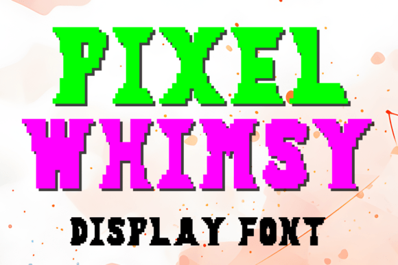
Pixel Whimsy: A Playful Display Font for Digital Branding
As a web designer who builds landing pages, SaaS dashboards, and boutique e-commerce experiences, I reach for display fonts not just to decorate—but to direct attention, reinforce voice, and shape how users feel before they even read a word. Pixel Whimsy fits that role with surprising precision. It’s a hand-crafted pixel art typeface—26 uppercase letters and digits 0–9—designed with intentional spacing, consistent stroke weight, and subtle character quirks that read as joyful, not chaotic.
This isn’t a retro novelty font you’d use once and abandon. Pixel Whimsy holds up in real layouts because its letterforms are built for digital clarity: generous x-height, open counters, and balanced proportions that prevent crowding at medium sizes (32px–72px). On a hero banner or app onboarding screen, it delivers instant recognition without sacrificing scannability. Its personality is warm, approachable, and quietly confident—ideal for brands that want to signal creativity without undermining professionalism.
Where Pixel Whimsy Earns Its Place in Your UI Kit
Use Pixel Whimsy where hierarchy matters most—and brevity is non-negotiable:
- Hero section headlines: Paired with a clean sans serif like Inter or Manrope, Pixel Whimsy anchors the top of a portfolio site or indie course sales page. Its charm draws the eye; the supporting font ensures legibility for the value proposition beneath.
- CTA buttons and micro-interactions: Try it at 24px on primary action buttons (“Start Free Trial”, “Grab Your Spot”)—but only when the background offers strong contrast. It works best on solid light or dark backgrounds, not busy image overlays.
- Product badges and feature tags: “New”, “Limited”, “Beta” — short labels gain memorability when set in Pixel Whimsy. Its fixed-width rhythm helps align these elements across responsive cards and grid layouts.
- Branded content sections: In a blog post about creative tools or a newsletter header, Pixel Whimsy adds editorial texture without competing with body copy.
Avoid using it for paragraphs, navigation menus, or form labels. It’s a display font—not meant for extended reading. And while it shines on desktop, test carefully on mobile: at under 28px, some characters lose definition. For small-screen CTAs, consider scaling up padding instead of shrinking the font.
Readability & Responsiveness: Practical Considerations
Pixel Whimsy performs reliably across devices when used intentionally. On light backgrounds, it reads crisply—even at 36px on iOS Safari. On dark mode interfaces, ensure your CSS applies a subtle text shadow (text-shadow: 0 1px 2px rgba(0,0,0,0.2)) to maintain edge definition. Avoid thin weights or condensed variants (Pixel Whimsy has no alternates or variable axes), so pair it with fonts that offer contrast in structure, not just weight.
For accessibility, always pair Pixel Whimsy with a WCAG-compliant body font—Inter, Open Sans, or IBM Plex Sans work well. Their neutral tone lets Pixel Whimsy carry expressive weight without overwhelming cognitive load. Never rely on Pixel Whimsy alone to communicate critical information; its decorative nature means screen readers will parse it correctly, but visual users need complementary context.
Smart Font Pairing for Digital Identity
Pixel Whimsy thrives in contrast. Its pixel-art DNA calls for grounded, functional companions:
- Sans serif pairings: Use Inter, Poppins, or Montserrat for body text, navigation, and data tables. Their geometric neutrality highlights Pixel Whimsy’s character without clashing.
- Serif pairings: For editorial or premium positioning (e.g., a design-focused newsletter or creative agency site), try Merriweather or Lora. The serif’s warmth echoes Pixel Whimsy’s handmade feel while adding typographic gravitas.
- Avoid pairing with other display fonts—especially script or handwritten styles. Pixel Whimsy already carries strong voice; layering expressive fonts dilutes hierarchy and confuses brand tone.
Remember: consistency matters more than variety. If you use Pixel Whimsy for your logo lockup, reuse it identically in social banners, email headers, and product packaging mockups. That repetition builds recognition faster than any color palette or icon system.
Licensing & Real-World Deployment
Pixel Whimsy is a commercial font—licensed for web use via WOFF2 files, compatible with modern CSS @font-face declarations and platforms like Webflow, Framer, and Shopify. When embedding, serve it from your own domain (not third-party CDNs) to avoid render delays and ensure GDPR compliance.
Licensing covers client projects, online stores, SaaS apps, and digital templates—as long as usage stays within the purchased scope. For agencies, confirm whether your license permits white-label distribution in theme kits or design systems. Always verify multilingual support: Pixel Whimsy currently includes Latin-1 characters only, so it’s ideal for English-first brands or bilingual sites with limited non-Latin needs.
In practice, I’ve used Pixel Whimsy for a children’s learning app’s milestone badges, a ceramicist’s online shop banner (“Handmade • Small Batch • Shipped With Love”), and a developer tool’s “Beta Launch” campaign page. Each time, it elevated tone without compromising usability—proof that whimsy and function aren’t mutually exclusive.
What makes Pixel Whimsy endure isn’t just its aesthetic—it’s how it behaves in context. It doesn’t shout. It invites. It signals care in craft, which users subconsciously associate with trust. In an interface landscape saturated with generic system fonts, choosing Pixel Whimsy is a quiet act of intentionality—one that pays off in engagement, recall, and brand cohesion.